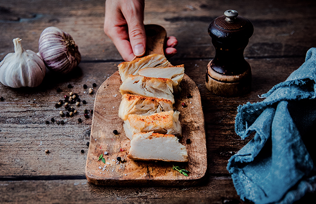
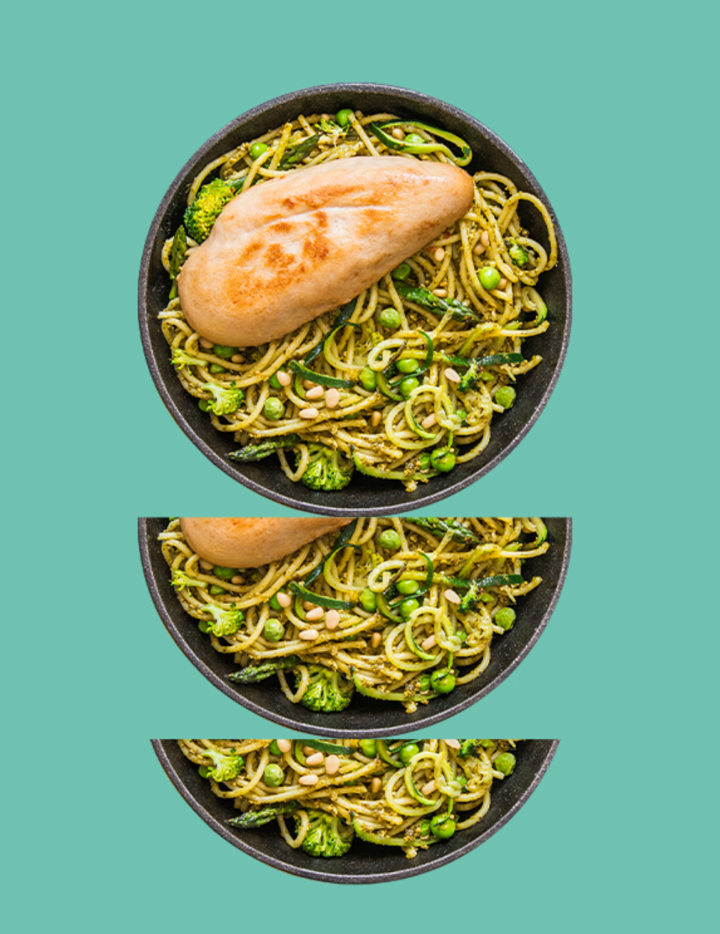
Umiami offers unique vegetable fillets with a real texture: visually and in the mouth.
Through the design, we wanted to express the amplified side of the product, particularly through the symbol of the logotype.
Expectations
We also came up with a tailor-made typography to ensure consistency. We also created a brand universe that was gourmet but remained corporate to match its target audience. We transposed amplification into the iconography. We played with word images to convey taste and pleasure, using round, gourmet typography. We used bright corporate colours to give the brand stature and flavour. The overall aim was to create new taste emotions through the brand's design and tone of voice. Now all that's left to do is sit down at the table!