Stade Français
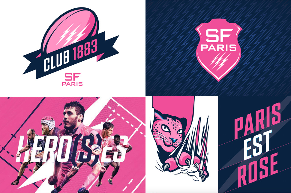
The Stade Français Paris has entrusted us with the redesign of its graphic universe, with the aim of modernising its identity while preserving the strength of its symbols.


Develop an icon by uniting all the fans.
A new visual rhythm for an iconic club.
In a collaborative approach, we worked with the founding elements of the club's identity - the pink, the éclairs and the coat of arms - to propose a more dynamic, contemporary and coherent interpretation.
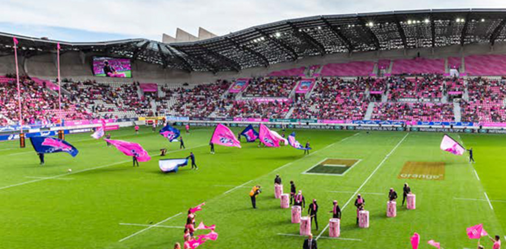
The new branding breathes rhythm and clarity into all the expressions of the Stade Français Paris, from digital to events and corporate communications.
A balancing act between tradition and modernity, designed to reinforce the uniqueness of a club that has always embodied boldness and elegance.
