Proneli: a strong identity for a school of excellence
Since 2015, Proneli Formation has been supporting therapists and coaches as they learn Neuro-Linguistic Programming (NLP). Present in over 35 cities, the school has established itself as a benchmark in NLP teaching.
Proneli's ambition was twofold: to create a strong, distinctive brand image, and to deploy an ecosystem combining meaning and precision.
Expectations
For Proneli, We have tried to convey the key concepts of NLP visually: introspection, evolution and clarification of ideas.
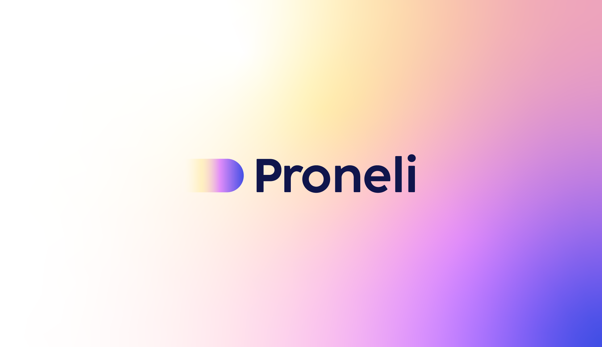
The logotype, designed as a founding element of the identity, reflects this approach. Its distinctive sign, inspired by the counter-form of the Proneli “P”, evokes an inner journey, a quest for greater self-understanding. Its slightly directional shape acts as a booster, It's an impetus towards a new way of thinking.
The choice of colour plays a central role: the gradient The subtle interplay between blurred and sharp areas illustrates the transition from diffuse to clear thinking, in perfect harmony with the benefits of NLP. The typography combines roundness and breathing, The new design provides optimum legibility while retaining a low profile. a human and reassuring dimension.
The visual identity is also enhanced by a system of pictograms inspired by the logo, extending this unique graphic territory. These visual elements, also marked by rounded shapes and gradations, illustrate different key concepts in learning and personal development.